
Turn your offer details into a polished counter-offer email written in three different tones.
ATS tool
ATS Resume Font & Formatting Checker
This ATS resume font checker does two jobs: it rates 34 common fonts as safe, risky or use-with-care, and it scans your actual CV to report the fonts, columns, tables and images inside it.
You get a formatting score out of 100 and a plain list of what to fix first.
- Free tool
- No signup
- Score in seconds
- Nothing leaves your device
- 34 fonts rated
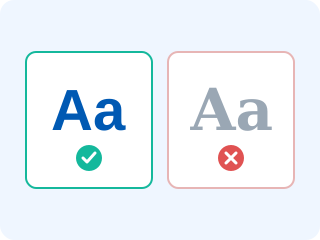
Scan your resume for formatting risks
Upload a PDF or DOCX and the checker reports the fonts it uses, plus the columns, tables and images that break ATS parsing. The file is read inside your browser and never uploaded.
Drop your resume here, or choose a file (PDF, DOCX or TXT, 5 MB max)
ATS friendly fonts vs risky fonts
34 fonts rated for parsing reliability and recruiter perception.
- ArialATS-safeSans-serif
Installed everywhere and parsed cleanly by every ATS. The safest possible choice.
- CalibriATS-safeSans-serif
Microsoft's default for years, so recruiters read it without noticing it. Excellent at 11pt.
- HelveticaATS-safeSans-serif
Mac equivalent of Arial. Substituted for Arial on Windows with no parsing issues.
- VerdanaATS-safeSans-serif
Very legible on screen, but wide — costs you around 8% more space than Arial.
- TahomaATS-safeSans-serif
Narrower than Verdana with the same clarity. Good when space is tight.
- LatoATS-safeSans-serif
Modern and embeds reliably in PDFs. A good way to look current without risk.
- Open SansATS-safeSans-serif
Designed for screens, parses cleanly, and never falls back to something ugly.
- RobotoATS-safeSans-serif
Neutral and compact. Popular with tech and design candidates.
- Source Sans ProATS-safeSans-serif
Open-source and well-hinted. Reads well down to 10pt.
- GeorgiaATS-safeSerif
The most readable serif on screen. A warm alternative to Times New Roman.
- CambriaATS-safeSerif
Built for print clarity at small sizes. Safe across Word and PDF exports.
- GaramondATS-safeSerif
Elegant and space-efficient. Set it a point larger than you think you need.
- Times New RomanATS-safeSerif
Parses perfectly, but reads as dated. Fine for law, finance and academia.
- Book AntiquaATS-safeSerif
Readable serif with a traditional feel. No parsing problems.
- Trebuchet MSATS-safeSans-serif
Friendly and widely installed. Slightly informal but entirely ATS-safe.
- Century GothicUse with careSans-serif
Parses fine but the wide geometric letterforms eat space and blur at 10pt.
- FuturaUse with careSans-serif
Not installed on many Windows machines, so a DOCX may substitute unpredictably.
- Gill SansUse with careSans-serif
Often missing outside macOS. Safe only if you send PDF with fonts embedded.
- AvenirUse with careSans-serif
Mac-only by default. Beautiful in PDF, risky in Word.
- PalatinoUse with careSerif
Fine in PDF; substitutes inconsistently in DOCX across platforms.
- Arial NarrowUse with careSans-serif
Condensed faces are harder to parse and signal that you are cramming content.
- Courier NewUse with careMonospace
Parses fine but wastes space and reads like a typewriter manual.
- RockwellUse with careSerif
Slab serif with limited installs. Headings only, if at all.
- Bookman Old StyleUse with careSerif
Heavy and wide. Legible but dated and space-hungry.
- Comic Sans MSRiskyScript / display
Parses fine — but it ends the conversation with most hiring managers.
- PapyrusRiskyScript / display
Decorative letterforms hurt readability and credibility in equal measure.
- Brush Script MTRiskyScript / display
Connected script characters are frequently misread or dropped by parsers.
- Lucida HandwritingRiskyScript / display
Handwriting fonts routinely produce garbled text extraction.
- Monotype CorsivaRiskyScript / display
Italic script — poor extraction accuracy and hard to skim.
- Segoe ScriptRiskyScript / display
Same problems as any handwriting face. Avoid on resumes entirely.
- ImpactRiskyScript / display
Ultra-condensed display face. Illegible in body text and aggressive in headings.
- Curlz MTRiskyScript / display
Novelty font. Recruiters read it as a lack of professional judgement.
- WingdingsRiskyScript / display
Symbol font — every character extracts as meaningless text or nothing at all.
- ZapfinoRiskyScript / display
Extreme calligraphic face. Unreadable at resume sizes and badly parsed.
How the resume formatting checker analyses your file
When you drop in a PDF, the tool opens it with a browser-based PDF engine and reads the embedded font names, the position of every text block, and the drawing operations the file contains. Font names tell it which typefaces you used. Text-block positions reveal whether content sits in one column or two — a sidebar produces a distinctive cluster of blocks starting past the middle of the page. Drawing operations reveal photos, logos, icons and the graphical skill bars that carry no text at all.
DOCX files are unzipped in the browser and read directly: the tool pulls font declarations from the styles and runs, counts table elements, counts embedded drawings, and detects a multi-column section setting. Every risk it finds carries a penalty weighted by how badly it damages parsing, and what is left is your score.
One caveat worth knowing: if almost no text can be extracted, your resume is probably a scan or an image-based export. That is the worst possible case for an ATS, because the parser sees a blank document, and the checker calls it out explicitly.
ATS friendly fonts and the ones to avoid
The safe list is short and boring on purpose: Arial, Calibri, Helvetica, Verdana, Tahoma, Georgia, Cambria, Garamond, Lato, Open Sans. Each is either installed on virtually every machine or embeds reliably in PDF, and each maps cleanly to standard characters so extraction is exact.
The risky list is anything decorative. Script and handwriting faces join letters together and use non-standard glyph mappings, so extracted text arrives with missing or scrambled characters. Symbol fonts such as Wingdings produce nothing usable at all. Between the two sits a caution group — Futura, Avenir, Gill Sans, Century Gothic — which parse fine but are missing from many Windows installs, so a DOCX may substitute something you never chose.
Whatever you pick, use one family. Two at most, one for headings and one for body. Three or more looks unplanned to a recruiter and adds nothing for the parser.
Formatting choices that matter more than the font
Font is the easiest thing to fix and rarely the biggest problem. These cause more damage:
- Two-column layouts. The single most common cause of scrambled parsing. Keep one column top to bottom.
- Tables. Dates and employers get detached from each other when a table is flattened.
- Contact details in the header or footer. Some parsers skip that region entirely, so your email vanishes.
- Text inside graphics. Skill rating bars, infographic timelines and logos contribute zero keywords.
- Non-standard section headings. "Where I've Been" is charming; "Experience" is parsed.
Fix the layout once and it pays off in every application. If your current file fights the parser at every turn, the free resume builder starts you from a single-column, ATS-tested template with a safe font already set, and then a free ATS scan of the finished file confirms both the formatting and the keyword match before you send it anywhere.
Frequently asked questions
Which fonts do ATS systems reject?
Modern parsers rarely reject a font outright — they misread it. Script, handwriting and symbol faces such as Brush Script, Lucida Handwriting, Segoe Script, Zapfino and Wingdings produce garbled or empty text extraction because their glyphs do not map cleanly to standard characters. Comic Sans and Papyrus parse fine but cost you credibility with the human reader.
Does font affect an ATS resume score?
Indirectly, and sometimes decisively. The score comes from the text the parser extracts, so a font that extracts badly lowers everything downstream — keyword matches, section detection, contact parsing. A safe font with a clean single-column layout removes that risk entirely.
What are the best fonts for a resume in an ATS?
Arial, Calibri, Helvetica, Georgia, Cambria, Garamond, Lato and Open Sans all parse perfectly and read well at 10-12pt. Choose one for the whole document and use size and weight, not a second typeface, to create hierarchy.
What margins and formatting should I use for ATS?
Margins of 0.5 to 1 inch, 10-12pt body text, 1.0-1.15 line spacing, standard section headings such as Experience and Education, and a single column throughout. Avoid headers and footers for contact details — some parsers ignore that region entirely.
Do tables and columns really break ATS parsing?
Often enough to matter. A parser that reads a two-column layout line by line interleaves your sidebar skills with your job history, producing sentences that make no sense to the scoring engine. Tables can collapse into a single run of text with dates detached from employers.
Does this checker upload my resume?
No. The PDF or DOCX is opened and parsed inside your browser tab, and nothing — file, text or result — is sent to a server or stored anywhere.
Formatting checked — now score the content
Upload your CV for a free ATS compatibility report: score, missing keywords, parsing warnings and prioritised fixes. No signup, nothing stored.
More free career tools
Log every application with company, role, date, status and notes. Saved in your browser, exportable to Excel.
Three single-column resume templates tested for ATS parsing. Download them free in Word or PDF, or open them in Google Docs.
See all 13 on the free resume tools hub.